Prepping for BIBA2022
Ignite will be exhibiting at BIBA this year alongside 100+ other companies. One of the main benefits of BIBA is speaking to many familiar faces, but we have a stand too and we want unfamiliar faces to get to know about Ignite and our team.
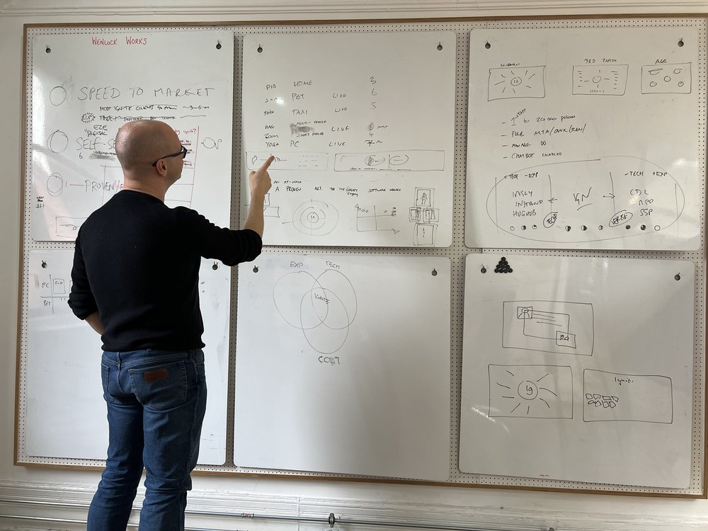
To that end I’ve just spent the day with various people in my team trying to distil the essence of Ignite’s company and product suite into a few eye-catching strap-lines and graphics.
This blog is a bit of an insight into the (slightly mad) process of putting together ideas for a stand at BIBA.
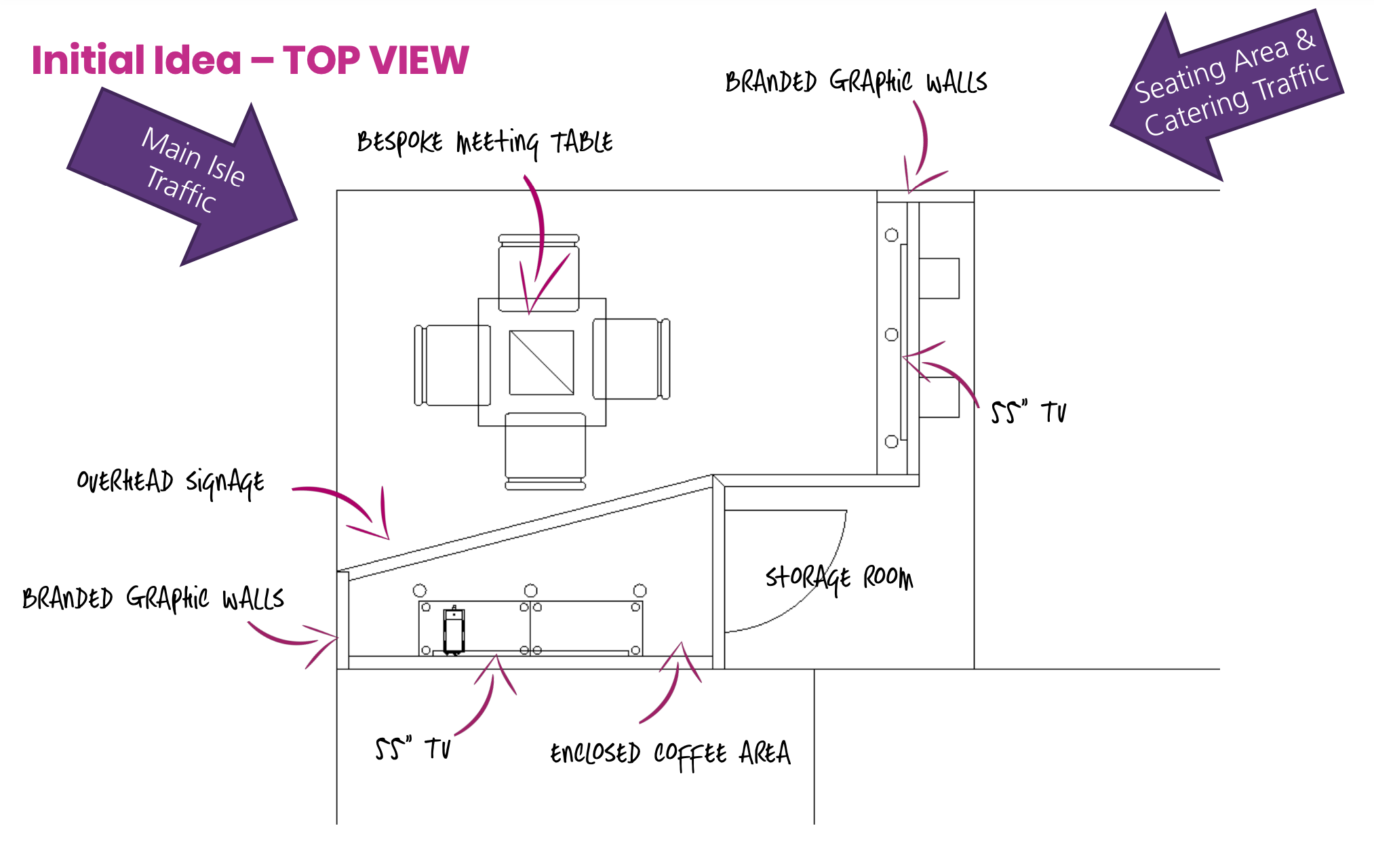
We already a stand layout design done, so this session was all about the content.
Here’s how it went down:
Questions
Broadly we considered these questions that people passing the Ignite stand might have:
- Who on earth are these Ignite people?
- What are they trying to sell me?
- Why would I ever want to buy it?
- What are they like as a company?
Themes
Addressing these questions in order we therefore thought we ought to make the themes of our messaging:
- What is Ignite? At a very high level: a fast-growing software house with increasing pedigree, disrupting legacy platforms and backed by the (enormous) Verisk group (that no-one has heard of)
- What does Ignite sell: we licence a policy management system, but that makes it sound so bland and average. Ignite’s uniqueness is that is it has good reliable tech (not the very latest but certainly not legacy) along with experience in delivering systems to personal lines brokers (which means lots of wrinkles ironed out and lots of critical integrations done). We’re both youthfully agile (8 years old) and old enough (8 years old) to have cut our teeth on some large projects and know our business. Someone mentioned the tagline: “big enough to deliver, small enough to care” – trite but we’re current that sort of size.
- Why choose Ignite: sure, we’re quick to market, end-to-end, low-code, reasonably priced, and agile – but so are all the other insurtechs out there. We’re also experienced (used by dozens of personal lines brokers) and process millions of quotes and millions in premium each month – but so do the legacy software houses. So we need a way of illustrating that we’re both innovative and experienced, because both are critical.
- What are we like as a company: agile but not naive; knowledgeable but not boring/corporate. This needs to come across in our language, the boldness of our statements, the openness of our demos, the honesty of what is achievable and what is not. And a bit of irreverence because life’s not fun if you take yourself too seriously.
Don’t mention the themes!
So these were our themes but, counterintuitively, we didn’t want to mention any of them. We wanted the reality – our systems, people, clients – to act as evidence of these things. We wanted people to infer these themes and ideas from what we were showing them. The content could not just say we are quick-to-market, experienced, or innovative. The content has to showcase speed, experience and innovation. It has to provide real-life implementation timescales, live integrations with enrichment and aggregators and AI, and visuals of the innovative chatbots, pricing tools, and customer journeys. If we have to tell people we’re innovative, that suggests we can’t show them we are.
Output
With this in mind we decided to fill the three key stand areas we have – top banner / side board / screens – with three key themes:
- What is Ignite: the UK’s fastest growing software house. This felt bold but has the advantages of being to the point, and true (by most metrics we could think of).
- What makes Ignite different: the combination of tech + experience – on top of all the tech you’d expect, we bring speed to market and enterprise experience
- Why buy it: visuals – the system should speak for itself. Put up on the screens the beautiful customer digital journeys, the chatbots, the self-service portal, and also the back office, the MI suite, etc. Put up case studies with video content and actual metrics of success. This feels open, exciting, refreshing, proud, and different.
This might seem self-evident, but it took us a good 6 hours (including burrito break) to mastermind.
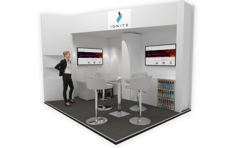
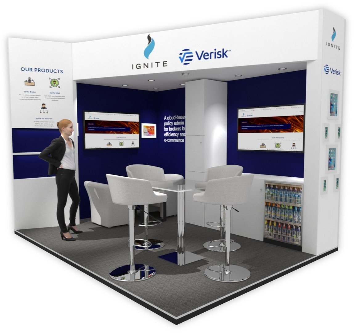
Visuals
Here are some early visuals that we were working with: